I've been using the redesigned Facebook profile and homepage for the past few days and thought it would be useful to write up my impressions on the changes. Facebook is now the the world's most popular social networking site and one of the ways they've gotten there is by being very focused on listening to their users and improving their user experienced based on this feedback. Below are screenshots of the old and new versions of the pages and a discussion of which elements are changed and the user scenarios the changes are meant to improve.
Homepage Redesign
OLD HOME PAGE: 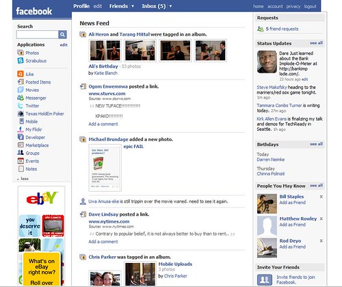
NEW HOME PAGE: 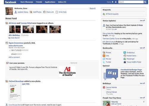
The key changes and their likely justifications are as follows
-
Entry points for creating content are now at the top of the news feed. One of the key features driving user engagement on Facebook is the News Feed. This lets a user know what is going on with their social network as soon as they logon to the site. In a typical example of network effects at work, one person creates some content by uploading a photo or sharing a link and hundreds of people on their friend list benefit by having content to view in their News Feed. If any of the friends responds to the content this again benefits hundreds of people and so on. The problem with the old home page was that a user sees their friends uploading photos and sharing links and may want to do so as well but there is no easy way for her to figure out how to do the same thing without having to go two or three clicks away from the home page. The entry points at the top of the feed will encourage more "impulse" content creation.
-
Left sidebar is gone. There were three groups of items in the left nav; a search box, the list of a user's most frequently accessed applications and an advertisement. The key problem is that the ad is in a bottom corner of the feed. This makes it easy for users to mentally segregate that part of the screen from their vision and either never look there or completely ignore it. Removing that visual ghetto and moving ads to being inline with the feed makes it more likely that users will look at the ad. Ah, but now you need more room to show the ad (all the space isn't needed for news feed stories). So the other elements of the left nave are moved, the search box to the header and the list of most accessed applications to the sidebar on the right. Now you have enough room to stretch out the News Feed's visible area and advertisers can reuse their horizontal banner ads on Facebook even though this makes the existing feed content now look awkward. This is one place where monetization trumped usability.
-
Comments now shown inline for News Feed items with comments (not visible in screen shot). This may be the feature that made Mike Arrington decide to call the new redesign the FriendFeedization of Facebook. Sites like FriendFeed have proven that showing the comments on an item in the feed inline gives users more content to view in their feeds and increases the likelihood of engagement since the user may want to join the conversation.
Profile Redesign
OLD PROFILE: 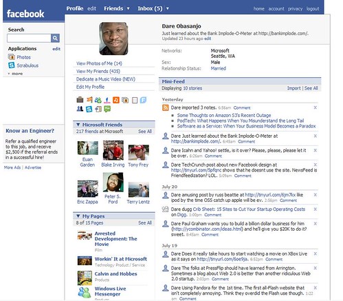
NEW PROFILE: 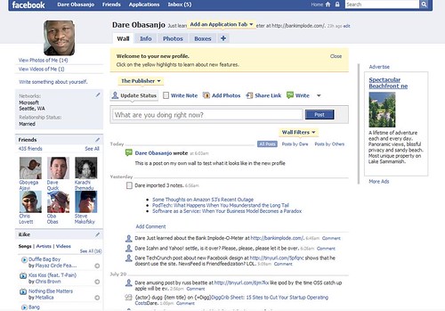
The key changes and their likely justifications are as follows
-
The profile now has tabbed model for navigation. This is a massive improvement for a number of reasons. The most important one is that in the old profile, there is a lot of content below the fold. My old profile page is EIGHT pages when printed as opposed to TWO pages when the new profile page is printed. Moving to a tabbed model (i) improves page load times and (ii) increases number of page views and hence ad impressions.
-
The Mini-Feed and the Wall have been merged. The intent here is to give more visibility to the Wall which in the old model was below the fold. The "guest book" or wall is an important part of the interaction model in social networking sites (see danah boyd's Friendster lost steam. Is MySpace just a fad? essay) and Facebook was de-emphasizing theirs in the old model.
-
Entry points for creating content are at the top of the profile page. Done for the same reason as on the Home page. You want to give users lots of entry points for adding content to the site so that they can kick off network effects by generating content which in turn generates tasty page views.
-
Left sidebar is gone. Again the left sidebar is gone and the advertisement is moved closer to the content, and away from the visual ghetto that is the bottom left of the screen. Search box and most accessed applications are now in the header as well. The intent here is also to improve the likelihood that users will view and react to the ads.
Now Playing: Da Back Wudz - I Don't Like The Look Of It (Oompa)