Last week, Douglas Bowman posted a screed against making web design based strictly on usage data. In a post entitled Goodbye Google, he wrote
With every new design decision, critics cry foul. Without conviction, doubt creeps in. Instincts fail. “Is this the right move?” When a company is filled with engineers, it turns to engineering to solve problems. Reduce each decision to a simple logic problem. Remove all subjectivity and just look at the data. Data in your favor? Ok, launch it. Data shows negative effects? Back to the drawing board. And that data eventually becomes a crutch for every decision, paralyzing the company and preventing it from making any daring design decisions.
Yes, it’s true that a team at Google couldn’t decide between two blues, so they’re testing 41 shades between each blue to see which one performs better. I had a recent debate over whether a border should be 3, 4 or 5 pixels wide, and was asked to prove my case. I can’t operate in an environment like that. I’ve grown tired of debating such minuscule design decisions. There are more exciting design problems in this world to tackle.
I can’t fault Google for this reliance on data. And I can’t exactly point to financial failure or a shrinking number of users to prove it has done anything wrong. Billions of shareholder dollars are at stake. The company has millions of users around the world to please. That’s no easy task. Google has momentum, and its leadership found a path that works very well.
One thing I love about building web-based software is that there is the unique ability to try out different designs and test them in front of thousands to millions of users without incurring a massive cost. Experimentation practices such as A/B testing and Multivariate testing enable web designers to measure the impact of their designs on the usability of a site on actual users instead of having to resort to theoretical arguments about the quality of the design or waiting until after they've shipped to find out the new design is a mistake.
Experimentation is most useful when you have a clear goal or workflow the design is trying to achieve and you are worried that a design change may impact that goal. A great example of this is how shopping cart recommendations were shipped at Amazon which is recalled in a great story told by Greg Linden in his post Early Amazon: Shopping cart recommendations excerpted below
The idea of recommending items at checkout is nothing new. Grocery stories put candy and other impulse buys in the checkout lanes. Hardware stores put small tools and gadgets near the register. But here we had an opportunity to personalize impulse buys. It is as if the rack near the checkout lane peered into your grocery cart and magically rearranged the candy based on what you are buying.Health food in your cart? Let's bubble that organic dark chocolate bar to the top of the impulse buys. Steaks and soda? Get those snack-sized potato chip bags up there right away.
I hacked up a prototype. On a test site, I modified the Amazon.com shopping cart page to recommend other items you might enjoy adding to your cart. Looked pretty good to me. I started showing it around.While the reaction was positive, there was some concern. In particular, a marketing senior vice-president was dead set against it. His main objection was that it might distract people away from checking out -- it is true that it is much easier and more common to see customers abandon their cart at the register in online retail -- and he rallied others to his cause.
At this point, I was told I was forbidden to work on this any further. I was told Amazon was not ready to launch this feature. It should have stopped there. Instead, I prepared the feature for an online test. I believed in shopping cart recommendations. I wanted to measure the sales impact. I heard the SVP was angry when he discovered I was pushing out a test. But, even for top executives, it was hard to block a test. Measurement is good. The only good argument against testing would be that the negative impact might be so severe that Amazon couldn't afford it, a difficult claim to make. The test rolled out.
The results were clear. Not only did it win, but the feature won by such a wide margin that not having it live was costing Amazon a noticeable chunk of change. With new urgency, shopping cart recommendations launched.
This is a great example of using data to validate a design change instead of relying on gut feel. However one thing that is often overlooked is that the changes still have to be well-designed. Shopping cart recommendations feature on Amazon is designed in such a way that it doesn't break you out of the checkout flow. See below for a screenshot of the current shopping cart recommendation flow on Amazon

On the above page, it is always very clear how to complete the checkout AND the process of adding an item to the cart is a one click process that keeps you on the same page. Sadly, a lot of sites have tried to implement similar features but often end up causing users to abandon shopping carts because the design encourages users to break their flow as part of the checkout process.
One of the places experimentation falls down is when it is used to measure the impact of aesthetic changes to the site when these changes aren't part of a particular workflow (e.g. changing the company logo). Another problem with experimentation is that it may encourage focusing on metrics that are easily measurable to the detriment of other aspects of the user experience. For example, Google's famous holiday logos were a way to show of the fun, light-hearted aspect of their brand. Doing A/B testing on whether people do more searches with or without the holiday logos on the page would miss the point. Similarly, sometimes even if A/B testing does show that a design impacts particular workflows it sometimes is worth it if the message behind the design benefits the brand. For example, take this story from Valleywag "I'm feeling lucky" button costs Google $110 million per year
Google cofounder Sergey Brin told public radio's Marketplace that around one percent of all Google searches go through the "I'm Feeling Lucky" button. Because the button takes users directly to the top search result, Google doesn't get to show search ads on one percent of all its searches. That costs the company around $110 million in annual revenue, according to Rapt's Tom Chavez. So why does Google keep such a costly button around?
"It's possible to become too dry, too corporate, too much about making money. I think what's delightful about 'I'm Feeling Lucky' is that it reminds you there are real people here," Google exec Marissa Mayer explained
~~~
Last night, I stumbled on a design change in Twitter that I suspect wouldn't have been rolled out if it had gone through experimentation first. On the Twitter blog, Biz Stone writes Replies Are Now Mentions
We're updating the Replies feature and referring to it instead as Mentions. In your Twitter sidebar you'll now see your own @username tab. When you click that tab, you'll see a list of all tweets referencing your account with the @username convention anywhere in the tweet—instead of only at the beginning which is how it used to work. So for me it would be all mentions of @biz. For developers, this update will also be included in the APIs.
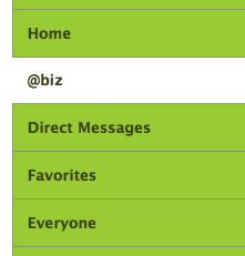
Compare the above sidebar with the previous one below and which do you think will be more intuitive for new users to understand?

This would be a great candidate to test because the metric is straightforward; compare clicks on the replies tab by new users using the old version as the control and the new version as the test. Then again, maybe they did A/B test it which is why the "@username" text is used instead of "Mentions" which is even more unintuitive. :)
 Now Playing: Jamie Foxx - Blame It (remix) (feat. T-Pain & Rosco)